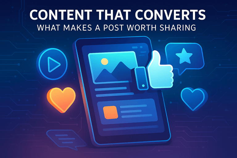
Because Pretty Alone Doesn’t Pay the Bills
In today’s fast-scrolling, content-saturated world, design can make or break your brand’s visibility. You have 1–3 seconds to stop the scroll — and if your content looks generic, it’s gone before it’s read.
But great visuals aren’t just about color and layout. They’re about strategy, brand alignment, and clear messaging.
At Grace Branding, we don’t just make things look good — we make them work.
❗ What Most Businesses Get Wrong About Design
Here’s what we often see in brands struggling with content visuals:
Over-designed graphics with too much text
Confusing layouts that don’t guide the eye
Inconsistent use of fonts and colors
Pretty templates that don’t fit the brand
No clear call to action — just “a nice post”
The result? A good-looking feed with poor-performing content.
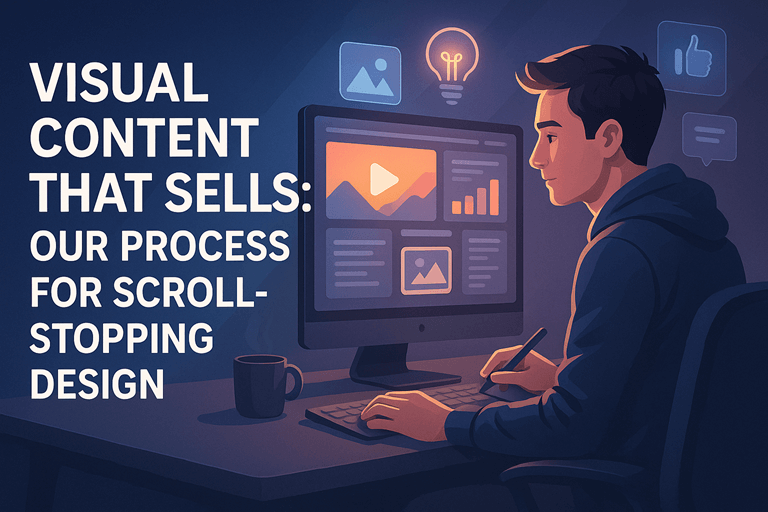
🎯 How We Design Scroll-Stopping Content at Grace Branding
We apply a visual strategy framework to everything we create — from single Instagram posts to full brand carousels.
🧩 1. Start With the Message
Before design, we define the goal of the post:
What should the audience learn, feel, or do?
What is the core message in 5 words or less?
This informs hierarchy, layout, and visual flow.
🖼️ 2. Design for Fast Eyes
People scan. So we:
Use bold, readable headlines
Keep text minimal but meaningful
Break long ideas into carousels or video sequences
Create “pause points” that invite interaction
🎨 3. Stay On-Brand
We apply your visual identity:
Consistent font styles and hierarchy
Brand-aligned color palettes
Iconography or photos that feel like you
No copy-paste Canva vibes — every post feels native to your brand.
✅ 4. Design With CTA in Mind
Every graphic includes space for direction:
Comment below
Save this tip
Click the link
DM for details
We don’t just inform — we guide.
✅ Real Example: From Low Reach to 10x Saves
One client posted educational content but saw little engagement. We redesigned her visuals using:
Branded headline boxes
Punchy, readable tips
Slide-style posts with visual rhythm
Her saves increased by 10x in 3 weeks, and comments doubled — with multiple new leads saying “I saw your carousel on [topic]!”
⚠️ Design Mistakes to Avoid
🚫 Trying to fit an essay into one post
🚫 Using 4+ fonts or too many colors
🚫 Not optimizing for mobile screen size
🚫 Ignoring visual flow — where the eye goes first
🚫 Designing without clear CTA or goal
A great design isn’t just seen — it gets remembered and acted on.
🏁 Final Thought
Your content has to earn attention before it earns trust. That starts with visuals that speak quickly, clearly, and on-brand.
With Grace Branding, your design doesn’t just look professional — it sells.
📞 Want Visual Content That Grabs Attention and Converts?
Our Brand Visibility Services include branded design templates, weekly graphics, carousel systems, and short-form visuals designed to perform.
👉 Book a Free Discovery Call
📩 Contact us now to elevate your visual presence.
🔗 Download Our Brochure