How Smart Visuals Build Trust Before You Say a Word.
In business, your logo is often your first impression — and first impressions are psychological. A well-designed logo isn’t just “nice to look at”; it speaks directly to how people feel about your brand, even before they read your tagline or scroll your website.
But what makes a logo work? Why do some logos instantly build trust, while others go unnoticed?
Let’s dive into the psychology behind great logo design — and why it matters more than you think.
❗ The Problem Most Entrepreneurs Overlook
Most businesses know they need a logo — but very few understand what their logo is actually doing. They see it as a visual check-box rather than a strategic tool for building trust, credibility, and memorability.
Here’s what happens without a well-designed logo:
Your brand looks generic or unprofessional
You fail to leave a lasting impression
People don’t remember your business (or take it seriously)
You miss the chance to emotionally connect with your audience
Logos are not just for looks — they’re your brand’s first handshake. A poorly designed one can repel more than it attracts.
🎯 The Subconscious Power of Design
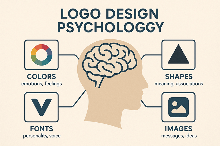
People process visuals 60,000 times faster than text. That means your logo is working for (or against) you within milliseconds. It can evoke credibility, creativity, energy, luxury, or calm — all depending on:
Color: Blue = trust and stability. Red = passion and urgency. Green = growth and calm.
Font: Serif fonts feel traditional. Sans-serif feels modern. Script fonts add elegance.
Shape: Circles feel friendly and inclusive. Squares feel balanced and logical. Triangles signal progress and direction.
These cues aren’t random—they’re rooted in emotional and cultural associations that help your audience feel something about your business instantly.
🧠 What the Best Logos All Have in Common
Simplicity – Think Apple, Nike, or McDonald’s. Simple shapes are memorable.
Relevance – The visuals match the brand’s values and audience.
Versatility – A good logo works on a website, a t-shirt, or a billboard.
Timelessness – It doesn’t follow trends. It starts them.
Memorability – If your client can draw it from memory, you’ve nailed it.
👩🏾🎨 Our Approach at Grace Branding
We don’t just make logos—we design brand anchors.
When we create a logo, we start by understanding your audience’s mindset, your brand personality, and the feeling you want to evoke. Then, we blend strategy with design psychology to build a mark that connects at first glance.
Each design phase is tested for clarity, meaning, emotion, and adaptability. Our goal? A logo that earns trust without needing an explanation.
✅ Real Example: Mazal Cosmetics
When Mazal Cosmetics came to us, they needed a look that spoke to modern African beauty—bold, clean, and premium. We used a strong typographic style with gold-accented icons that aligned with elegance and trust. The result? A logo that made buyers feel they were engaging with a sophisticated brand — before even seeing the product line.
⚠️ Common Mistakes to Avoid
Overcomplicating with too many effects or ideas
Using trendy fonts or free icons that aren’t unique
Skipping strategy and jumping straight to visuals
Forgetting to test logo visibility in small sizes
🏁 Final Thought
Your logo isn’t decoration — it’s the handshake your brand makes with the world. Make it intentional. Make it unforgettable.
📞 Ready to Design Your Logo?
Grace Branding offers logo design as part of our full Brand Identity Services. Let’s help you create a visual identity that earns attention, builds trust, and grows your brand.
👉 Book a Free 30 mins Discovery Call
📩 Contact us now and let’s build something real, together.
🔗 Download Our Brochure

